


OANA flag design proposed by the Mehr News Agency (MNA) from Iran will be displayed on the OANA webpage for 2 months. If there is no other flag designs proposed during this time Mehr's design will be accepted as the OANA flag as it's agreed on the 33rd OANA Executive Board Meeting in Mongolia in June 2011. If you have a different design for OANA flag please send new designs and suggestions to international@aa.com.tr
Following is the explanation about the flag design by the Mehr News Agency.
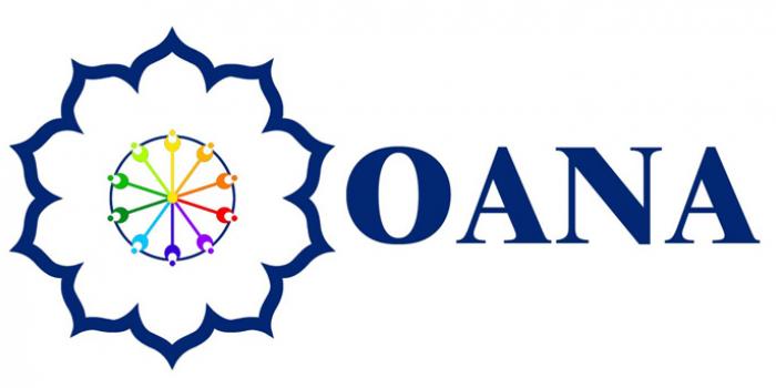
''The flag consists of the official emblem of the OANA all in blue on a white background except the 10 lines in the center of emblem which are in different colors representing numbers diversity of colors and races inhabited in the two continents of Asia and Pacific. There are 10 lines representing 10 members of the OANA Executive Board. And a point in the center where the lines intersect each others represents OANA president. The lines are interlaced with a circle showing their unity.
The white color that appears in the background of the insignia was chosen to be the color of purity. White means kindness. It is not a color, but the manifestation of the presence of all color - the complete energy of light. It stands for wholeness and completion. In many cultures it represents openness and truth. White has a cold quality. It can provide clarity as its energy is complete.
All are the beauties set as the OANA goals.
So the design is symbolically white: It represents the necessity of transparency and clarification of the news disseminated by the members and underlines our main goals and motto in the organization – bringing about clarity and securing direct and free exchange of news between the news agencies of a region inhabited by more than half of the world's population.''