


It is great respect that Australian Associated Press acknowledges the efforts of the MEHR news agency in its creation of a flag for OANA. It supports the use of the MEHR design presented in Mongolia for official functions leading up to OANA's 50th anniversary celebration.
But AAP reiterates its support for a more contemporary design for OANA's branding in the future – for the OANA website, official documents and for a new flag from 2012.
It is therefore with great pleasure that AAP submits logo and flag design suggestions to OANA members for consideration and feedback.
Representatives at AAP are happy to refine these suggestions based on the commentary of the membership at the next Executive Board Meeting.
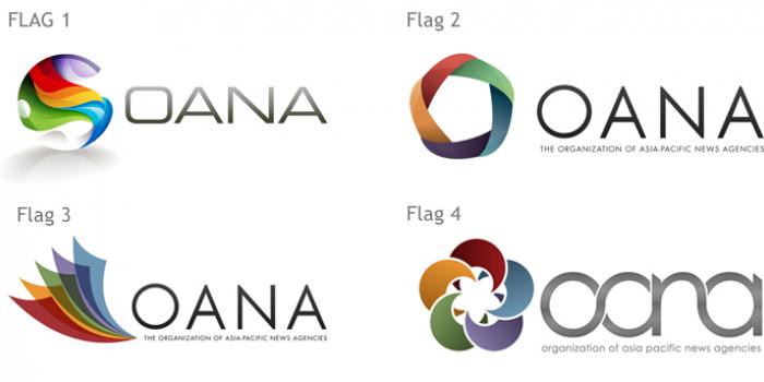
For the purpose of these discussions, AAP submits four very different design suggestions but all have similar symbolic meanings.
All designs are built around the notion of unity, cooperation and diversity.
Rather than represent only the 10 founding members of OANA, as the existing logo does, the designs signify the five Asian regions of the OANA membership as determined at the 2010 General Assembly.
Confederation of Independent States
West Asia
East Asia
South-East Asia
Australasia
The colours are important and while there may be geographical symbolism that can be depicted by colours it is nearly impossible to accurately represent each diverse region in this way.
So we have opted for colours with meaning and that express certain emotions that are positive and underline the principles of good news agencies.
Each can have varied meanings depending on cultures but we opted for the following:
RED: For nobility, intelligence, integrity, good luck. It is also considered a colour that encourages action and confidence.
ORANGE: For kinship and happiness. It is a colour that stimulates activity.
BLUE: For audaciousness and vigour. It is a soothing colour.
GREEN: For a sense of renewal and harmony.
PURPLE: For nobility and pride. It is a colour that signifies wealth, creativity and is an uplifting colour.
While each of the designs are significantly different each has the theme of harmony and cooperation with elements within each interlinking.
The following descriptions support each design.
OANAFLAG1 includes a colour design element that it is an abstract geographical representation of the Asia regions of OANA. The outlines of each region (see diagram OANAflag1a) come together in a harmonious mix of the OANA colours.
OANAFlag2 includes a colour design showing the linking together of the five regions each dependent on the others to complete a circle.
OANAFlag3 brings the five regions together in a representation of news origins in print. The interweaving of the five sheets and the colours create new related colours meaning productivity from cooperation.
OANAFlag4 shows a symmetrical interlocking of the five shapes that combine to create a flower a symbol that has great meaning all throughout Asia.
Tony Gillies
Editor in Chief